Case study 06 · SPORT · Prensa Ibérica · 2023—2026
SPORT Illustrations — Building character without breaking the product language.
The role of this case is deliberately different from 42DS or SPORT Cards: it shows art direction, composition and visual identity through the original illustration assets themselves.
In 30 seconds
- The tension
- SPORT needed illustrations one at a time, on a fixed palette, inside a photographic newspaper they could not compete with.
- My call
- Draw each one for its product moment, then write down the grammar the set already had: silhouette, palette, humour, placement.
- The evidence
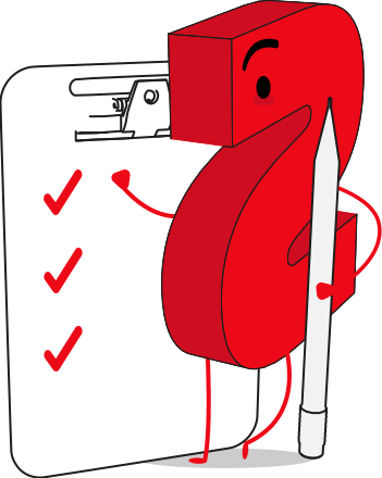
- 17 original SVG assets, reviewed one by one with SPORT and used in newsletter, subscription, surveys and empty states.
- What changed
- The seasonal ones were retired, as expected. The ones tied to a product state are still in use.
- Role
- Illustration and art direction — the seventeen assets are mine
- Context
- SPORT editorial ecosystem
- Evidence
- 17 original SVG assets
- Used in
- Newsletter · subscription · surveys · empty states
How it started
It started as one asset, not as a set.
The first one was a one-off: a product moment that needed an image and did not have one. Then another moment needed one, and then another. At some point the question stopped being what this particular drawing should look like and became what all of them had to have in common. That is when a handful of illustrations turns into something worth solving properly, and it is also when it becomes possible to get it wrong at scale.
The set
Seventeen assets, one grammar.
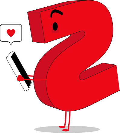
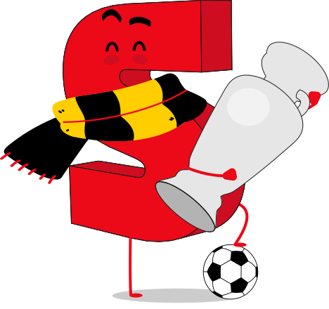
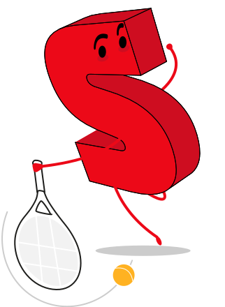
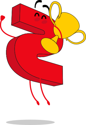
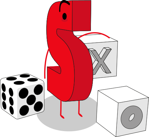
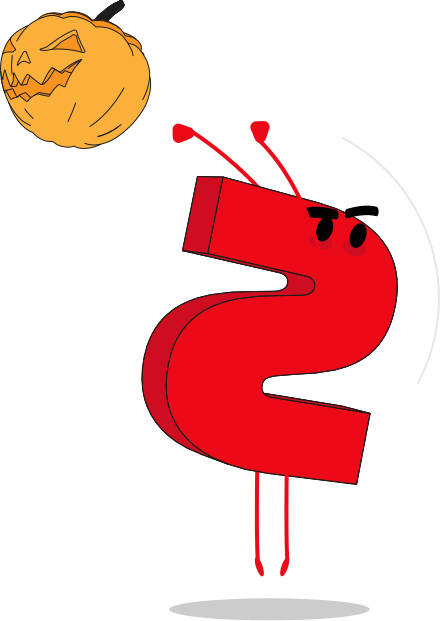
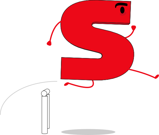
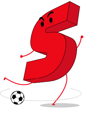
Each one answers a specific product moment — a survey, a failed process, a subscription, a match day — with the same silhouette, the same palette and the same register of humour.








The team
The set grew because someone kept asking for the next one.
I drew them, but I did not decide when the set needed to grow. Deborah Garcelán Vargas, then at SPORT, reviewed each illustration with me and told me which one was missing next as communication needs came up. That is why the seventeen cover the moments they cover: the list was never designed in advance, it was requested one piece at a time. It is also why the grammar could only be written at the end — you cannot extract the rules of a set while the set is still being asked for.
- Deborah Garcelán VargasSPORT at the time — reviewed every illustration and asked for the new ones as communication needs appearedLinkedIn ↗
Intent
Distinctive enough to have character. Flexible enough to live inside a product.
The set covers different editorial and product needs — sport, engagement, newsletter, subscription and utility contexts — without turning every asset into a separate visual universe.
What shaped them
Three limits, and all three are visible in the drawings.
None of them was mine to negotiate, and the set looks the way it looks because of them.
- What I worked inside
- SPORT is a photographic newspaper and its palette was already fixed. The illustration could not compete with the photography for attention, and it could not invent colour to tell one asset apart from another.
- What that cost
- A quieter register than I would have chosen, and less separation between assets than a free palette would have given me. They were also drawn around other work rather than in time set aside for them, which puts a ceiling on how far any single one got pushed.
Visual grammar
Variation comes from scenario. Consistency comes from the visual grammar.
I did not decide these four rules and then draw. I drew, then looked at what the drawings already had in common, and wrote that down. The order matters more than it sounds: a grammar extracted from work that exists describes something real, while one declared in advance is a wish. These four are what let a Halloween asset and a failed-process asset belong to the same family.
Simple, bold forms keep the asset legible at editorial scale.
Colour reinforces SPORT identity without overwhelming the surrounding UI.
Small narrative gestures make functional moments feel less generic.
Assets can work as standalone illustrations, empty states or contextual support.
What happened after
Some of them have been retired, and that was always going to happen.
A set that holds Euro 2024 and Halloween next to a failed-process state has two different lifespans built into it from the start. The ones tied to a moment have gone. The ones tied to a permanent product state are the reason the grammar had to exist in the first place: an empty state does not stop being needed. That split is visible in the sheet above once you look for it, and it is the part of the brief nobody writes down.
Takeaway
Systems thinking should make visual expression easier to scale — not flatten it.
The grammar is what makes seventeen assets readable as one set; the scenarios are what keep them from looking like seventeen copies.